R Markdown Tips
General remarks
In general, you should aim for your report to be readable: imagine writing this for someone who is interested in the statistical results and general conclusions, but does not want to see the R code (unless you’re using it to make a point). You shouldn’t show anything without explaining it: before any figure or a table or the output of some R code, you should say, using sentences, what it is and what we’re supposed to get from it.
Below are two examples of showing the same data. Maybe your first drafts will look more like the “bad” example. But then, you should go back and look at what you did, and explain what we’re looking at and why, hide unncessary R code, label the axes. (Note that this is a very minimal example: an actual report would have more context and interpretation.)
Bad example
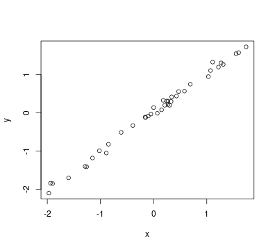
We got the weight changes over the first and second weeks.
x <- c(-0.1, 0.47, -1.02, 0.25, 0.07, -0.15, 1.74, 0, -1.94, -1.9,
    0.27, -1.6, 0.15, 0.18, -0.85, 0.43, 0.33, 0.21, 1.31, 0.34,
    0.3, -0.61, 1.07, 1.11, 0.69, 1.22, -0.39, 1.55, 0.58, -0.89,
    1.27, -1.26, 1.03, 0.27, -0.05, -1.15, -0.16, -1.29, -1.97, 1.6)
y <- c(-0.08, 0.56, -0.99, 0.31, -0.01, -0.12, 1.73, 0.14, -1.84,
    -1.85, 0.22, -1.7, 0.08, 0.33, -0.82, 0.44, 0.3, 0.2, 1.27, 0.42,
    0.2, -0.51, 1.11, 1.33, 0.75, 1.2, -0.33, 1.55, 0.57, -1.05,
    1.31, -1.41, 0.95, 0.31, -0.03, -1.18, -0.11, -1.4, -2.1, 1.58)
# correlation coefficient
cor(x, y)
## [1] 0.9968713
plot(x, y)

Good example
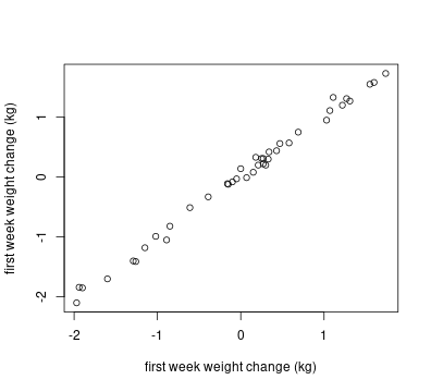
The weight change across the two weeks are highly correlated with each other (r^2 = 0.997), as shown in the following plot:

A longer example
We have also provided a “full” example:
- the assignment
- a solution: Rmarkdown source
- a solution: rendered html
This example is a rather short assignment, but it should give you the idea.
Tips
Below are a few tips on how to keep the homework reports looking clean. Getting your output to look nice can be quite frustrating at first, and it’s more important for you to learn the statistical concepts and how to talk about them. So, we encourage you to go for “good enough”, but try to improve your homeworks a little every week. If something in your homework looks really ugly, but you just can’t figure out how to fix it, then just say so: we’ll give you some tips.
-
Output html: If you’re using pdf as an output, keep in mind knitr does not automatically wrap your code chunks, and they will run off the page if too long. Be aware of this and add line breaks where appropriate. With this in mind, it may be optimal to knit to html.
-
Minimize R output: Usually you shouldn’t include particular R outputs in your final version of homeworks. You should for sure look at and use the output for yourself, but you can just refer to the important results in-line when writing your analyses.
-
Use inline code chunks: To reference previously computed statistics outside your code chunks, use inline code chunks. The syntax is like:
the p-value was `r test$p.val`.. You can tinker with the round() or formatC() functions to deal with rounding and formatting the numerical value. -
Format code: You can also use single back ticks (
` `) to reformat a word to look like code. This is mostly for aesthetic purposes, but if I want to tell the reader I’m using the R function, say, anova, then writing “we will be utilizing theanovafunction to…” will help it stand out more. -
Nice tables: When presenting statistics in a table, try to avoid supplying just the R output. Remember, you are presenting this information to someone that can read statistics, but is not familiar with R. Look into table making packages such as kableExtra.
-
Think about figure widths: Another aesthetic preference, but figures could be wider to fill up the unused white space in the page, making them larger and easier to read. You can tinker with the fig.width and fig.height code chunk options, and fig.width=10 will make your figures as wide as the page.
-
Squash warnings: To prevent messages or warnings from showing up in your pdf or html file (for example, after loading a package) you can add message=FALSE and warning=FALSE into your chunk options.
-
Label axes: Try to avoid letting R set the axis labels, as they could just be R code like
data$variablewhen instead you want a nicer looking label. It only takes one more line of code and your figures will thank you for it. -
Set the seed: If you set the random seed in the first (set-up) chunk of your document, by doing something like
set.seed(123), then any randomness (e.g., simulations) in your report will produce exactly the same output every time you knit the document.